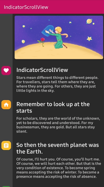
Reacts dynamically with an indicator when the scroll is changed.

Add below codes to your root build.gradle file (not your module build.gradle file).
allprojects {
    repositories {
        jcenter()
    }
}
And add a dependency code to your module's build.gradle file.
dependencies {
    implementation "com.github.skydoves:indicatorscrollview:1.0.2"
}Add following XML namespace inside your XML layout file.
xmlns:app="http://schemas.android.com/apk/res-auto"Here is a basic example of implementing IndicatorScrollView and indicatorView.
<com.skydoves.indicatorscrollview.IndicatorScrollView
  xmlns:android="http://schemas.android.com/apk/res/android"
  xmlns:app="http://schemas.android.com/apk/res-auto"
  android:id="@+id/indicatorScrollView"
  android:layout_width="match_parent"
  android:layout_height="wrap_content">

  <LinearLayout
    android:layout_width="match_parent"
    android:layout_height="wrap_content"
    android:orientation="horizontal">

    <com.skydoves.indicatorscrollview.IndicatorView
      android:id="@+id/indicatorView"
      android:layout_width="60dp"
      android:layout_height="match_parent"
      android:background="@color/background800"
      android:paddingLeft="6dp"
      android:paddingRight="6dp"
      app:indicator_expandingRatio="0.2" // expands when an indicator item reaches the display's height ratio.
      app:indicator_expandingAllItemRatio="0.9" // expands all items when scroll reaches a specific position ratio.
      app:indicator_itemPadding="6dp" // padding size between indicator items.
    />

    <LinearLayout
      android:layout_width="match_parent"
      android:layout_height="match_parent"
      android:orientation="vertical"
      android:paddingBottom="40dp">

      // some complicated views..

      <LinearLayout // This layout will be used for composing indicator.
        android:id="@+id/section1"
        android:layout_width="match_parent"
        android:layout_height="wrap_content"/>

      <LinearLayout  // This layout will be used for composing indicator.
        android:id="@+id/section2"
        android:layout_width="match_parent"
        android:layout_height="wrap_content"

    </LinearLayout/>
  </LinearLayout>
</com.skydoves.indicatorscrollview.IndicatorScrollView>
IndicatorScrollView is a scrollView for reacting with IndicatorView when scroll is changed.
It extends NestedScrollView. So it must have a ViewGroup child like what LinearLayout or RelativeLayout.
IndicatorView is an indicator view for reacting to IndicatorScrollView when the scroll is changed.
It should be used in IndicatorScrollView.
We can create an instance of the IndicatorView using IndicatorView.Builder class.
val indicatorView = IndicatorView.Builder(this)
  .setIndicatorItemPadding(16)
  .setExpandingRatio(0.2f)
  .setExpandingAllItemRatio(1.0f)
.build()We should bind an IndicatorView to IndicatorScrollView like bellow.
indicatorScrollView.bindIndicatorView(indicatorView)IndicatorItem is an attribute item data for composing the IndicatorView.
We can create an instance of the IndicatorItem using the IndicatorItem.Builder class.
val myIndicatorItem =
    IndicatorItem.Builder(section1) // section1 is the target view for the start of expanding.
    .setItemColor(myColor) // sets the background color of the indicator item using value.
    .setItemColorResource(R.color.colorPrimary) // sets the background color of the item using resource.
    .setItemIcon(myIcon) // sets the icon of the indicator item using drawable.
    .setItemIconResource(R.drawable.ic_heart) // sets the icon of the indicator item using resource.
    .setItemDuration(400) // sets the expanding and collapsing duration.
    .setItemCornerRadius(40f) // sets the corner radius of the indicator item.
    .setItemIconTopPadding(12) // sets the padding top value between the indicator items.
    .setExpandedSize(600) // customizes the fully expanded height size.
    .build()
We can create it using kotlin dsl.
val myIndicatorItem = indicatorItem(section1) {
  setItemColor(myColor) // sets the background color of the indicator item using value.
  setItemColorResource(R.color.colorPrimary) // sets the background color of the item using resource.
  setItemIcon(myIcon) // sets the icon of the indicator item using drawable.
  setItemIconResource(R.drawable.ic_heart) // sets the icon of the indicator item using resource.
  setItemDuration(400) // sets the expanding and collapsing duration.
  setItemCornerRadius(40f) // sets the corner radius of the indicator item.
  setItemIconTopPadding(12) // sets the padding top value between the indicator items.
  setExpandedSize(600) // customizes the fully expanded height size.
}
And add the instance of the IndicatorItem to IndicatorView.
indicatorView.addIndicatorItem(myIndicatorItem)

// or we can use plus operator.
indicatorView + myIndicatorItemWe can customize the expanding and collapsing animation.
IndicatorAnimation.NORMAL
IndicatorAnimation.ACCELERATE
IndicatorAnimation.BOUNCE| NORMAL | ACCELERATE | BOUNCE |
|---|---|---|
 |
 |
 |
| Attributes | Type | Default | Description |
|---|---|---|---|
| expandingRatio | Float | 0.2 | expands when an indicator item reaches the display's height ratio. |
| expandingAllItemRatio | Float | 0.9 | expands all items when scroll reaches a specific position ratio. |
| itemPadding | Dimension | 6dp | padding size between indicator items. |
Support it by joining stargazers for this repository. :star:
And follow me for my next creations!
Copyright 2019 skydoves (Jaewoong Eum)

Licensed under the Apache License, Version 2.0 (the "License");
you may not use this file except in compliance with the License.
You may obtain a copy of the License at

   http://www.apache.org/licenses/LICENSE-2.0

Unless required by applicable law or agreed to in writing, software
distributed under the License is distributed on an "AS IS" BASIS,
WITHOUT WARRANTIES OR CONDITIONS OF ANY KIND, either express or implied.
See the License for the specific language governing permissions and
limitations under the License.